Show real strength
Use honest training moments, bold type, and direct messages. Confidence comes from clarity, not hype.
Brand guide · Local ad toolkit · Version 1.0
Use this guide to create clear, recognizable posters, flyers, social ads, and community partnerships that help more people find their strength at Lil's Gym.
01 · Foundation
Lil's Gym is a straightforward strength gym with a kind community. The brand should feel capable without feeling exclusive, energetic without shouting, and local without looking small.
Use honest training moments, bold type, and direct messages. Confidence comes from clarity, not hype.
Give people one message and one next step. Keep the offer, location, and call to action easy to find.
Write for people at every experience level. Focus on progress, support, and strength for life.
02 · Logo
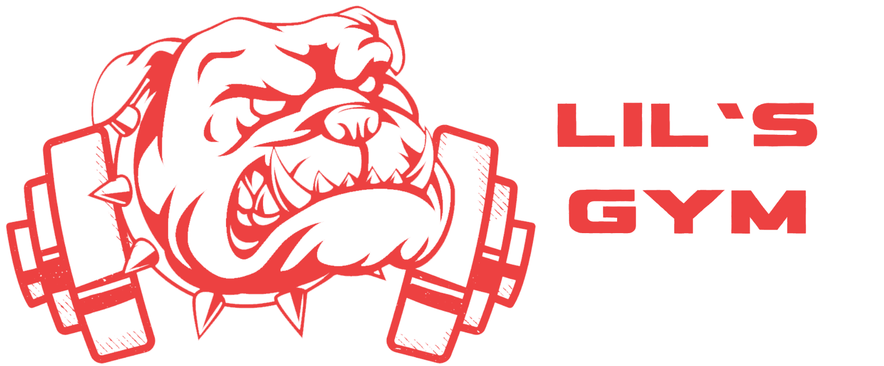
Use the complete red bulldog-and-wordmark logo whenever space allows. The transparent master works on white, black, and simple photography with enough contrast.
03 · Colour
Black and white do most of the work. Red creates recognition and directs attention. Use one red role at a time so the design stays focused.
#ED4141Logo, large display accents, rules#B71C1CButtons and small areas with white text#5C0000Large panels and campaign backgrounds#0A0A0AHeadlines, backgrounds, body text#FFFFFFSpace, reverse type, clean contrast#F7F7F7Quiet backgrounds and information panelsScreen-only flare: The website may use a gradient from #FF3D3D to #FF6B6B in large display moments. Do not use that gradient for body text, small type, or the logo. For print, give the printer these RGB values and approve a press proof using their CMYK profile.
04 · Typography
Bebas Neue gives campaign headlines their strength. Inter keeps the details calm and readable. Both are free Google Fonts and already support the current site style.
Build strength with practical coaching, a kind community, and 24/7 member access in downtown Kitchener.
Use uppercase for short headlines, section labels, and key numbers. Keep display lines compact. Do not use it for paragraphs.
Use Regular or Medium for body copy and Semibold or Bold for calls to action. Avoid long lines and tiny print.
05 · Voice
Talk to one person. Use plain language and active verbs. Invite people to begin instead of judging where they are today.
06 · Photography
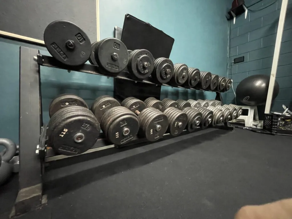
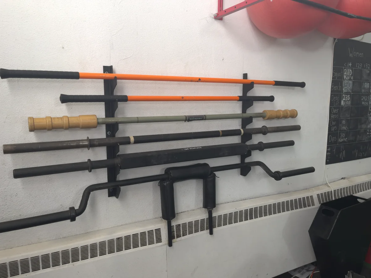
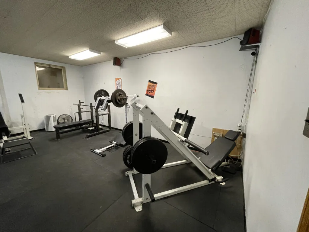
Choose real moments inside Lil's Gym: a focused lift, a coach helping, training partners connecting, or the equipment ready for use. The image should make the space feel active and approachable.
07 · Local ad system
A street poster has only a few seconds to work. Build every layout in this order, then remove anything that competes with the main message.
08 · Ready-made posters
These 11×17 poster starters use the approved system and link directly to the free-tour page. Open the full poster gallery to preview, print, or download both community-posting PDFs.
Photo-led awareness poster with a free-tour call to action.
Bold 24/7-access poster designed for fast street-level reading.
09 · Production
Start with the placement, not the design. A poster read from across a café needs different scale than a handout or a social post.
| Format | Canvas | Safe area | Export |
|---|---|---|---|
| Street poster | 11 × 17 in | Keep essentials 0.25 in inside trim | Sized print PDF; high-resolution images preferred |
| Letter flyer | 8.5 × 11 in | Keep essentials 0.25 in inside trim | Sized print PDF; high-resolution images preferred |
| Social portrait | 1080 × 1350 px | Keep text 60 px from edges | sRGB PNG or high-quality JPG |
| Story or reel cover | 1080 × 1920 px | Keep key text away from interface areas | sRGB PNG or high-quality JPG |
The supplied poster PDFs are sized to 11×17 inches, use the site's current web-resolution photos, and do not include bleed. They work best for short-run community printing. Before a commercial run, replace the photos with approved high-resolution originals and ask the printer to add 0.125 inches of bleed on every side. Keep QR codes at least 1 inch wide, preserve their white quiet zone, and test the final printed proof from a normal scanning distance.
10 · Approval checklist
This is a working standard for authorized Lil's Gym material. Confirm image rights and current offers before public use. Guide and site implementation: Copyright © 2026 ColinKnapp.com. All rights reserved. Lil's Gym name, logo, and photography remain with their respective rights holders.